Capstone Project: Salifort Motors HR Suggestion

Capstone project: Providing data-driven suggestions for HR
Description and deliverables
This capstone project is an opportunity for you to analyze a dataset and build predictive models that can provide insights to the Human Resources (HR) department of a large consulting firm.
Upon completion, you will have two artifacts that you would be able to present to future employers. One is a brief one-page summary of this project that you would present to external stakeholders as the data professional in Salifort Motors. The other is a complete code notebook provided here. Please consider your prior course work and select one way to achieve this given project question. Either use a regression model or machine learning model to predict whether or not an employee will leave the company. The exemplar following this actiivty shows both approaches, but you only need to do one.
In your deliverables, you will include the model evaluation (and interpretation if applicable), a data visualization(s) of your choice that is directly related to the question you ask, ethical considerations, and the resources you used to troubleshoot and find answers or solutions.
PACE stages

Pace: Plan
Consider the questions in your PACE Strategy Document to reflect on the Plan stage.
In this stage, consider the following:
Understand the business scenario and problem
The HR department at Salifort Motors wants to take some initiatives to improve employee satisfaction levels at the company. They collected data from employees, but now they don’t know what to do with it. They refer to you as a data analytics professional and ask you to provide data-driven suggestions based on your understanding of the data. They have the following question: what’s likely to make the employee leave the company?
Your goals in this project are to analyze the data collected by the HR department and to build a model that predicts whether or not an employee will leave the company.
If you can predict employees likely to quit, it might be possible to identify factors that contribute to their leaving. Because it is time-consuming and expensive to find, interview, and hire new employees, increasing employee retention will be beneficial to the company.
Familiarize yourself with the HR dataset
The dataset that you’ll be using in this lab contains 15,000 rows and 10 columns for the variables listed below.
Note: you don’t need to download any data to complete this lab. For more information about the data, refer to its source on Kaggle.
| Variable | Description |
|---|---|
| satisfaction_level | Employee-reported job satisfaction level [0–1] |
| last_evaluation | Score of employee’s last performance review [0–1] |
| number_project | Number of projects employee contributes to |
| average_monthly_hours | Average number of hours employee worked per month |
| time_spend_company | How long the employee has been with the company (years) |
| Work_accident | Whether or not the employee experienced an accident while at work |
| left | Whether or not the employee left the company |
| promotion_last_5years | Whether or not the employee was promoted in the last 5 years |
| Department | The employee’s department |
| salary | The employee’s salary (U.S. dollars) |
💭
Reflect on these questions as you complete the plan stage.
- Who are your stakeholders for this project?
- What are you trying to solve or accomplish?
- What are your initial observations when you explore the data?
- What resources do you find yourself using as you complete this stage? (Make sure to include the links.)
- Do you have any ethical considerations in this stage?
Step 1. Imports
- Import packages
- Load dataset
Import packages
# Import packages
### YOUR CODE HERE ###
import pandas as pd
import numpy as np

import matplotlib.pyplot as plt
import seaborn as sns

from sklearn.linear_model import LogisticRegression
from sklearn.tree import DecisionTreeClassifier
from sklearn.ensemble import RandomForestClassifier
from xgboost import XGBClassifier
from xgboost import XGBRegressor
from xgboost import plot_importance

from sklearn.model_selection import train_test_split, GridSearchCV
from sklearn.metrics import accuracy_score, precision_score, recall_score, f1_score, confusion_matrix, ConfusionMatrixDisplay, classification_report, roc_auc_score, roc_curve
from sklearn.tree import plot_tree
Load dataset
Pandas is used to read a dataset called HR_capstone_dataset.csv. As shown in this cell, the dataset has been automatically loaded in for you. You do not need to download the .csv file, or provide more code, in order to access the dataset and proceed with this lab. Please continue with this activity by completing the following instructions.
# RUN THIS CELL TO IMPORT YOUR DATA.

# Load dataset into a dataframe
### YOUR CODE HERE ###
df0 = pd.read_csv("HR_capstone_dataset.csv")


# Display first few rows of the dataframe
### YOUR CODE HERE ###
df0.head()
| satisfaction_level | last_evaluation | number_project | average_montly_hours | time_spend_company | Work_accident | left | promotion_last_5years | Department | salary | |
|---|---|---|---|---|---|---|---|---|---|---|
| 0 | 0.38 | 0.53 | 2 | 157 | 3 | 0 | 1 | 0 | sales | low |
| 1 | 0.80 | 0.86 | 5 | 262 | 6 | 0 | 1 | 0 | sales | medium |
| 2 | 0.11 | 0.88 | 7 | 272 | 4 | 0 | 1 | 0 | sales | medium |
| 3 | 0.72 | 0.87 | 5 | 223 | 5 | 0 | 1 | 0 | sales | low |
| 4 | 0.37 | 0.52 | 2 | 159 | 3 | 0 | 1 | 0 | sales | low |
Step 2. Data Exploration (Initial EDA and data cleaning)
- Understand your variables
- Clean your dataset (missing data, redundant data, outliers)
Gather basic information about the data
# Gather basic information about the data
### YOUR CODE HERE ###
df0.info()
<class 'pandas.core.frame.DataFrame'>
RangeIndex: 14999 entries, 0 to 14998
Data columns (total 10 columns):
 #   Column                 Non-Null Count  Dtype
---  ------                 --------------  -----
 0   satisfaction_level     14999 non-null  float64
 1   last_evaluation        14999 non-null  float64
 2   number_project         14999 non-null  int64
 3   average_montly_hours   14999 non-null  int64
 4   time_spend_company     14999 non-null  int64
 5   Work_accident          14999 non-null  int64
 6   left                   14999 non-null  int64
 7   promotion_last_5years  14999 non-null  int64
 8   Department             14999 non-null  object
 9   salary                 14999 non-null  object
dtypes: float64(2), int64(6), object(2)
memory usage: 1.1+ MB
Gather descriptive statistics about the data
# Gather descriptive statistics about the data
### YOUR CODE HERE ###
df0.describe()
| satisfaction_level | last_evaluation | number_project | average_montly_hours | time_spend_company | Work_accident | left | promotion_last_5years | |
|---|---|---|---|---|---|---|---|---|
| count | 14999.000000 | 14999.000000 | 14999.000000 | 14999.000000 | 14999.000000 | 14999.000000 | 14999.000000 | 14999.000000 |
| mean | 0.612834 | 0.716102 | 3.803054 | 201.050337 | 3.498233 | 0.144610 | 0.238083 | 0.021268 |
| std | 0.248631 | 0.171169 | 1.232592 | 49.943099 | 1.460136 | 0.351719 | 0.425924 | 0.144281 |
| min | 0.090000 | 0.360000 | 2.000000 | 96.000000 | 2.000000 | 0.000000 | 0.000000 | 0.000000 |
| 25% | 0.440000 | 0.560000 | 3.000000 | 156.000000 | 3.000000 | 0.000000 | 0.000000 | 0.000000 |
| 50% | 0.640000 | 0.720000 | 4.000000 | 200.000000 | 3.000000 | 0.000000 | 0.000000 | 0.000000 |
| 75% | 0.820000 | 0.870000 | 5.000000 | 245.000000 | 4.000000 | 0.000000 | 0.000000 | 0.000000 |
| max | 1.000000 | 1.000000 | 7.000000 | 310.000000 | 10.000000 | 1.000000 | 1.000000 | 1.000000 |
Rename columns
As a data cleaning step, rename the columns as needed. Standardize the column names so that they are all in snake_case, correct any column names that are misspelled, and make column names more concise as needed.
# Display all column names
### YOUR CODE HERE ###
df0.columns
Index(['satisfaction_level', 'last_evaluation', 'number_project',
       'average_montly_hours', 'time_spend_company', 'Work_accident', 'left',
       'promotion_last_5years', 'Department', 'salary'],
      dtype='object')
# Rename columns as needed
### YOUR CODE HERE ###
df0 = df0.rename(columns={'Work_accident':'work_accident',
                         'average_montly_hours':'average_monthly_hours',
                         'Department':'department'})

# Display all column names after the update
### YOUR CODE HERE ###
df0.columns
Index(['satisfaction_level', 'last_evaluation', 'number_project',
       'average_monthly_hours', 'time_spend_company', 'work_accident', 'left',
       'promotion_last_5years', 'department', 'salary'],
      dtype='object')
Check missing values
Check for any missing values in the data.
# Check for missing values
### YOUR CODE HERE ###
df0.isna().sum()
satisfaction_level       0
last_evaluation          0
number_project           0
average_monthly_hours    0
time_spend_company       0
work_accident            0
left                     0
promotion_last_5years    0
department               0
salary                   0
dtype: int64
Check duplicates
Check for any duplicate entries in the data.
# Check for duplicates
### YOUR CODE HERE ###
df0.duplicated().sum()
3008
# Inspect some rows containing duplicates as needed
### YOUR CODE HERE ###
df0[df0.duplicated()].head()
| satisfaction_level | last_evaluation | number_project | average_monthly_hours | time_spend_company | work_accident | left | promotion_last_5years | department | salary | |
|---|---|---|---|---|---|---|---|---|---|---|
| 396 | 0.46 | 0.57 | 2 | 139 | 3 | 0 | 1 | 0 | sales | low |
| 866 | 0.41 | 0.46 | 2 | 128 | 3 | 0 | 1 | 0 | accounting | low |
| 1317 | 0.37 | 0.51 | 2 | 127 | 3 | 0 | 1 | 0 | sales | medium |
| 1368 | 0.41 | 0.52 | 2 | 132 | 3 | 0 | 1 | 0 | RandD | low |
| 1461 | 0.42 | 0.53 | 2 | 142 | 3 | 0 | 1 | 0 | sales | low |
Likelihood of these duplicated entries being legitimate responses is low due to the many different continuous variables in the table. Hence we are treating these entries as if the employees have been reported twice in the dataset by mistake and removing them.
# Drop duplicates and save resulting dataframe in a new variable as needed
### YOUR CODE HERE ###
df = df0.drop_duplicates(keep='first')

# Display first few rows of new dataframe as needed
### YOUR CODE HERE ###
df.head()
| satisfaction_level | last_evaluation | number_project | average_monthly_hours | time_spend_company | work_accident | left | promotion_last_5years | department | salary | |
|---|---|---|---|---|---|---|---|---|---|---|
| 0 | 0.38 | 0.53 | 2 | 157 | 3 | 0 | 1 | 0 | sales | low |
| 1 | 0.80 | 0.86 | 5 | 262 | 6 | 0 | 1 | 0 | sales | medium |
| 2 | 0.11 | 0.88 | 7 | 272 | 4 | 0 | 1 | 0 | sales | medium |
| 3 | 0.72 | 0.87 | 5 | 223 | 5 | 0 | 1 | 0 | sales | low |
| 4 | 0.37 | 0.52 | 2 | 159 | 3 | 0 | 1 | 0 | sales | low |
Check outliers
Check for outliers in the data.
# Create a boxplot to visualize distribution of `tenure` and detect any outliers
### YOUR CODE HERE ###
plt.figure(figsize=(8,6))
sns.boxplot(x=df['time_spend_company'])
plt.title("Outliers for time spent in company")
plt.show()
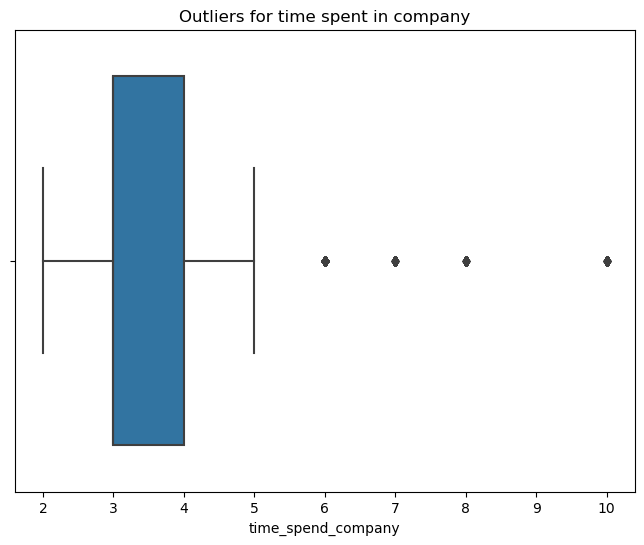
# Determine the number of rows containing outliers
### YOUR CODE HERE ###
q1 = df['time_spend_company'].quantile(0.25)
q3 = df['time_spend_company'].quantile(0.75)
iqr = q3-q1

ul = q3 + 1.5*iqr
ll = q1 - 1.5*iqr

print("Upper limit: " + str(ul) + ", Lower Limit: " + str(ll))

outliers = df[(df['time_spend_company'] > ul)|(df['time_spend_company'] < ll)]

print("Number of outliers: " + str(len(outliers)))
Upper limit: 5.5, Lower Limit: 1.5
Number of outliers: 824
We see that employees that have spent at least 5.5 years with the company are considered outliers, numbering a total of 824 employees in this dataset.
Certain types of models are more sensitive to outliers than others. When you get to the stage of building your model, consider whether to remove outliers, based on the type of model you decide to use.
pAce: Analyze Stage
- Perform EDA (analyze relationships between variables)
💭
Reflect on these questions as you complete the analyze stage.
- What did you observe about the relationships between variables?
- What do you observe about the distributions in the data?
- What transformations did you make with your data? Why did you chose to make those decisions?
- What are some purposes of EDA before constructing a predictive model?
- What resources do you find yourself using as you complete this stage? (Make sure to include the links.)
- Do you have any ethical considerations in this stage?
Step 2. Data Exploration (Continue EDA)
Begin by understanding how many employees left and what percentage of all employees this figure represents.
# Get numbers of people who left vs. stayed
### YOUR CODE HERE ###
print(df['left'].value_counts())
# Get percentages of people who left vs. stayed
### YOUR CODE HERE ###
print(df['left'].value_counts(normalize=True))
left
0    10000
1     1991
Name: count, dtype: int64
left
0    0.833959
1    0.166041
Name: proportion, dtype: float64
We observe that this is an imbalanced dataset and will need to take necessary action to account for this when predictive modelling.
Data visualizations
Now, examine variables that you’re interested in, and create plots to visualize relationships between variables in the data.
# Create a plot as needed
### YOUR CODE HERE ###
plt.figure(figsize=(12,8))
sns.boxplot(data=df, x='average_monthly_hours', y='number_project', hue='left', orient='h')
plt.title('Monthly hours vs Number of Projects')
plt.show()
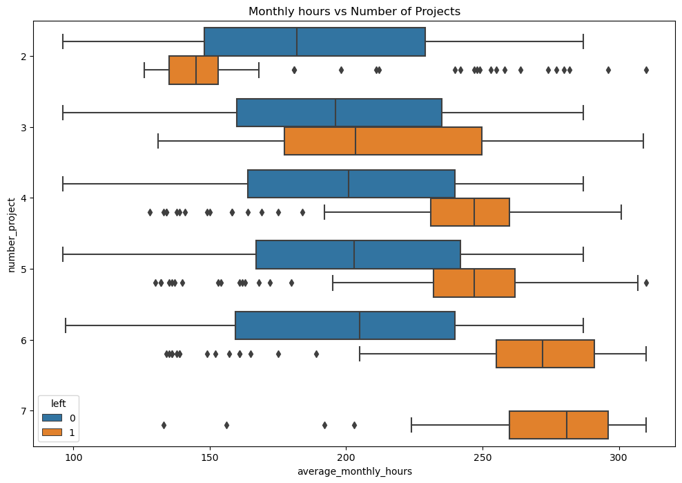
From a box plot showing the employees’ average monthly working hours vs number of projects, accounting for their attrition status we can make a few observations.
- Above 4 projects, employees that have left were usually working longer hours than those who have stayed
- At 2 projects, employees that have left were usually working shorter hours than those who have stayed
- Taking into account a 40 hour work week (160~170 hrs/mth), most employees in this company are overworked in terms of monthly hours regardless of the number of projects that are working on
- At 7 projects all employees have left the company. They also have the highest average monthly hours compared to any other group.
# Create a plot as needed
### YOUR CODE HERE ###
plt.figure(figsize=(10,6))
sns.histplot(data=df, x='number_project', hue='left', multiple='dodge')
plt.title('Number of Projects')
plt.show()
C:\Users\wenhao\anaconda3\envs\exp\Lib\site-packages\seaborn\_oldcore.py:1119: FutureWarning: use_inf_as_na option is deprecated and will be removed in a future version. Convert inf values to NaN before operating instead.
  with pd.option_context('mode.use_inf_as_na', True):
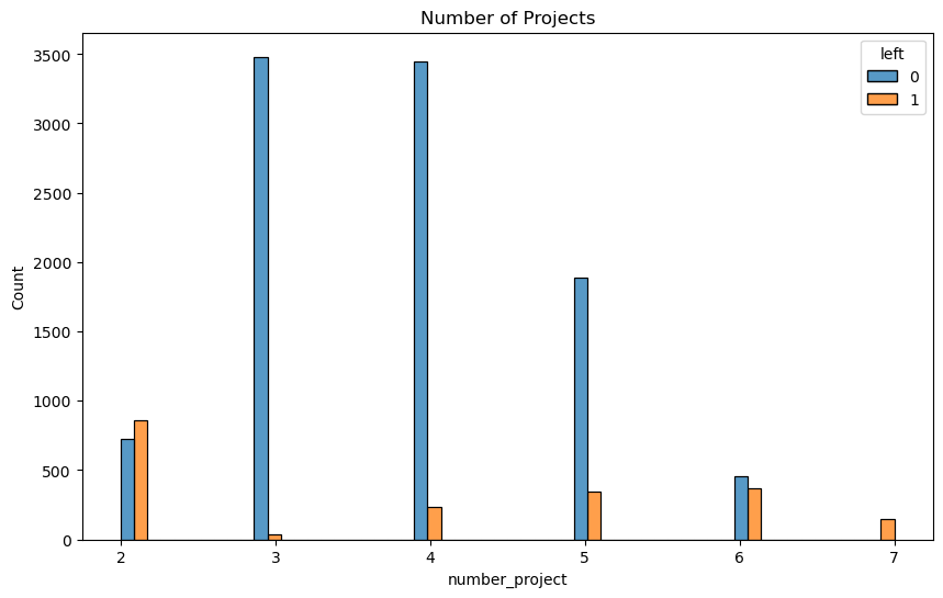
From the histogram showing the number of employees vs the number of projects that they are working on, accounting for their attrition status we can make a few observations
- 3/4 projects seem to be optimal due to the relatively low ratio of employees who have left in these groups.
- Attrition rates for 6/7 projects are high.
- Attrition rate for 2 projects is high.
The observations from the boxplot and histogram suggests that there are mainly two groups of employees that are attriting
- Employees with 2 projects and shorter working hours, these may be employees that were on their resignation notice period or to be fired. Hence they may have been assigned less work to facilitate their transition out of the company
- Employees with 4~7 projects and longer working hours than their counterparts. These may be employees who are dissatisfied with their working conditions and quit
# Create a plot as needed
### YOUR CODE HERE ###
plt.figure(figsize=(16,9))
plt.title('Monthly Hours vs Satisfaction Level')
sns.scatterplot(data=df, x='average_monthly_hours',y='satisfaction_level',hue='left')
plt.axvline(x=167, color='red', ls='--',label='167 hrs/mth')
plt.legend(labels=['167 hrs/mth','left','stayed'])
<matplotlib.legend.Legend at 0x18868948950>
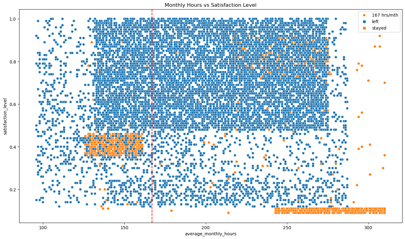
Looking at a scatterplot of the average monthly working hours vs satisfaction level of the employee, we can make a few observations (167 hrs/mth line appproximates where a 40 hour work week would be on the scatterplot)
- The distribution of the data appears too strange and is indicative of synthetic data. In this case this appears to be data created for the purpose of learning hence we will continue working with it as we would with regular data.
- One group of employees that left expressed relatively low satisfaction levels (~0.4) and were working less hours than a typical 40 hour work week.
- Another group of employees that left expressed the lowest satisfaction levels (~0) and were working the most hours in the company. ```python # Create a plot as needed ### YOUR CODE HERE ### plt.figure(figsize=(12,8)) sns.boxplot(data=df, x='satisfaction_level',y='time_spend_company', hue='left', orient='h') plt.title('Satisfaction vs Time Spent in Company') plt.show() ``` 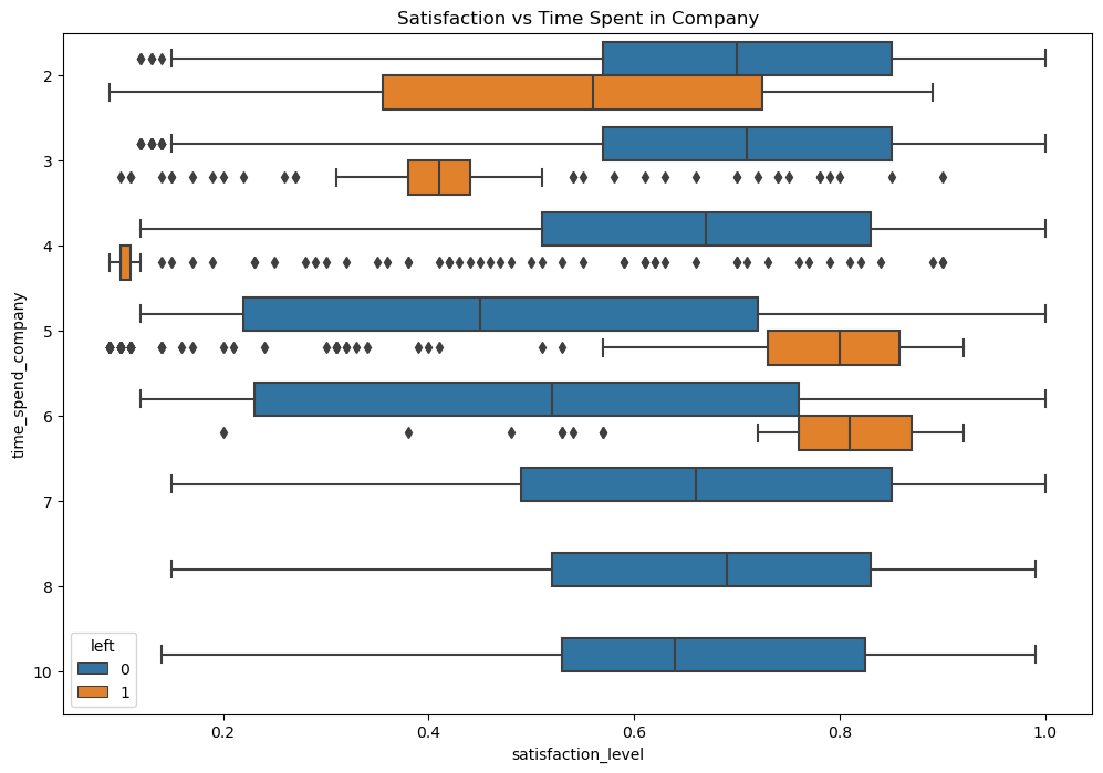 A boxplot of the satisfaction level vs the time the employee has spent in the company tells us the following
- Satisfaction level of the employees who stayed are similar across the various tenures except for 5/6 years tenure employees who stayed and reported a lower satisfaction level than other employees.
- Employees who left at the 4 year mark reported satisfaction levels of ~0.0, coupled with the low satisfaction levels of employees who stayed in 5/6 year marks this may suggest some company policies issues that may have affected this group of employees specifically.
- The histogram shows that none of the employees on a longer tenure (>6 years) have left the company
- The high attrition rate at the 4/5 year marks presents further evidence that there may be an issue with company policies that may have affected this group of employees specifically that may be worth investigating.
- Seems to be no strong correlation between hours worked and evaluation score.
- Mainly two groups of employees left the company, one group received high evaluation scores and worked long hours suggesting that they performed very well in their roles. Another group received low evaluation scores and worked short hours suggesting that they underperformed in their roles.
- Almost all employees that have been promoted within the past 5 years stayed.
- All employees that worked at least 300 monthly hours without a promotion left the company. ```python plt.figure(figsize=(10,8)) sns.histplot(data=df, x='department', hue='left', multiple='dodge', shrink=.5) plt.title('Department Turn Over') plt.xticks(rotation=45,horizontalalignment='right') ``` C:\Users\wenhao\anaconda3\envs\exp\Lib\site-packages\seaborn\_oldcore.py:1119: FutureWarning: use_inf_as_na option is deprecated and will be removed in a future version. Convert inf values to NaN before operating instead. with pd.option_context('mode.use_inf_as_na', True): ([0, 1, 2, 3, 4, 5, 6, 7, 8, 9], [Text(0, 0, 'sales'), Text(1, 0, 'accounting'), Text(2, 0, 'hr'), Text(3, 0, 'technical'), Text(4, 0, 'support'), Text(5, 0, 'management'), Text(6, 0, 'IT'), Text(7, 0, 'product_mng'), Text(8, 0, 'marketing'), Text(9, 0, 'RandD')]) 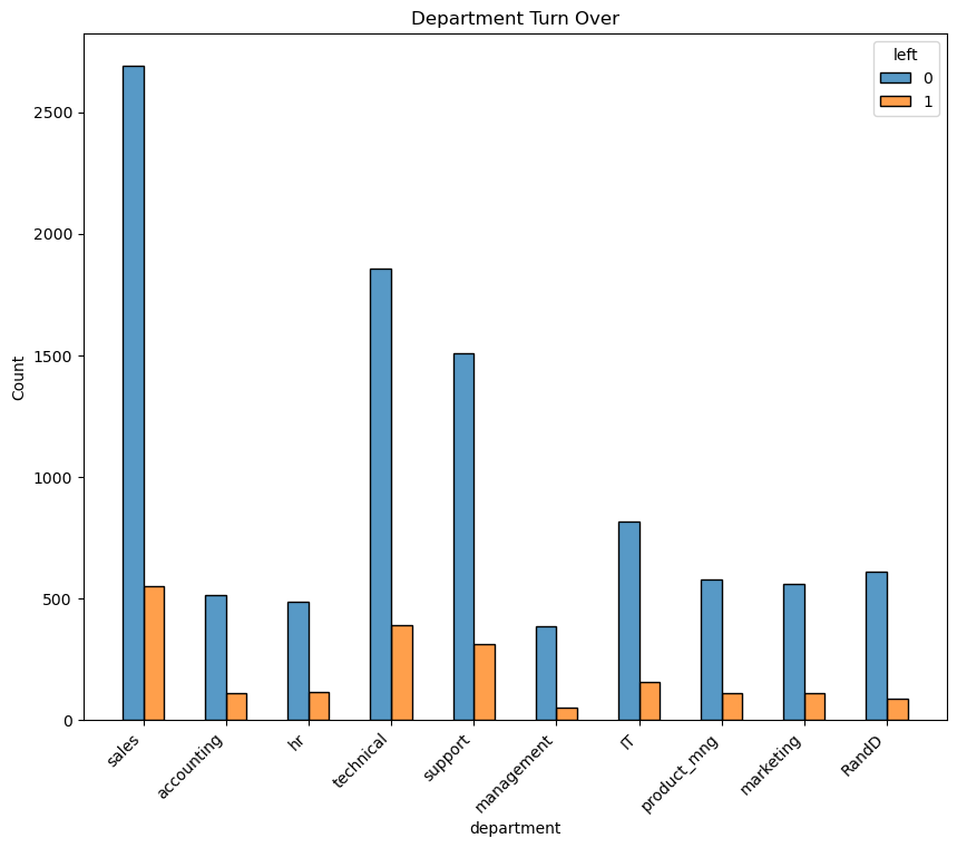 No department seems to be suffering from attrition disproportionately. ```python plt.figure(figsize=(16,9)) sns.heatmap(df.corr(numeric_only=True), vmin=-1, vmax=1, annot=True, cmap=sns.diverging_palette(220, 20, as_cmap=True)) plt.title('Correlation Heatmap') ``` Text(0.5, 1.0, 'Correlation Heatmap') 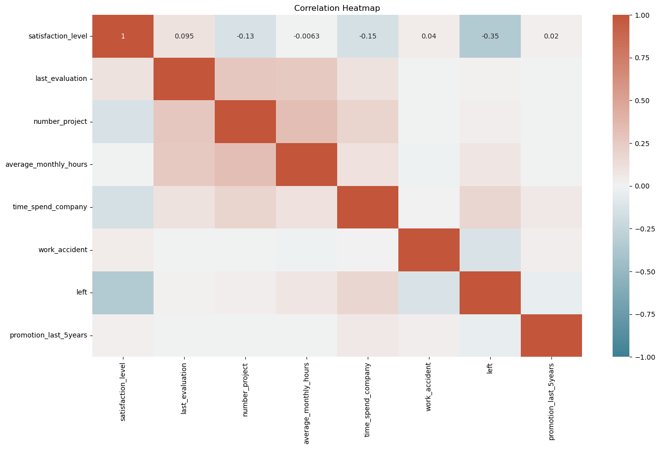 Looking at the correlation heatmap we see that satisfaction level, work accident occurence, and recent promotions are negatively correlated with an employee leaving. All other factors are positively correlated with employee leaving. Satisfaction level, work accident occurence, and time spent in the company are the factors most strongly correlated to attrition. ### Insights Attrition in this case appears to be tied to poor management of the company. From above analysis we see a significant portion of the employees leaving are good performers that were working long hours receiving good evaluation scores. However they may not have been properly compensated or appreciated by the company for their contributions and efforts. In addition, there are also evidences pointing to company policies surrounding the 4 year tenure mark that is driving employees satisfaction down and increasing attrition in the following years. # paCe: Construct Stage - Determine which models are most appropriate - Construct the model - Confirm model assumptions - Evaluate model results to determine how well your model fits the data 🔎 ## Recall model assumptions **Logistic Regression model assumptions** - Outcome variable is categorical - Observations are independent of each other - No severe multicollinearity among X variables - No extreme outliers - Linear relationship between each X variable and the logit of the outcome variable - Sufficiently large sample size 💭 ### Reflect on these questions as you complete the constructing stage. - Do you notice anything odd? - Which independent variables did you choose for the model and why? - Are each of the assumptions met? - How well does your model fit the data? - Can you improve it? Is there anything you would change about the model? - What resources do you find yourself using as you complete this stage? (Make sure to include the links.) - Do you have any ethical considerations in this stage? ## Step 3. Model Building, Step 4. Results and Evaluation - Fit a model that predicts the outcome variable using two or more independent variables - Check model assumptions - Evaluate the model ### Identify the type of prediction task. Base on data that is available, predict whether a employee leaves a company. This is a binary classification problem to predict the "left" column of the dataset. ### Identify the types of models most appropriate for this task. We will be exploring the use of logistic regression and some tree based models to complete this task. ### Modeling #### Modeling Approach A: Logistic Regression Model We will start with implementing a Logistic Regression model. As non-numeric variables have to be encoded, we will start by encoding the "department" and "salary" columns. "salary" will be encoded ordinally as there is a hierachy to the categories in this column while "department" will be dummy encoded. ```python # Encoding categorical variables ### YOUR CODE HERE ### df_encode = df.copy() df_encode['salary'] = df_encode['salary'].astype('category').cat.set_categories(['low','medium','high']).cat.codes df_encode = pd.get_dummies(data=df_encode, drop_first=False) df_encode.head() ```
- "satisfaction level" - it is likely that the company will not have the latest data reported for all of its employees before attrition, so this feature will be dropped.
- "average monthly hours" - our EDA suggests that some of the attrited employees may have been placed on shorter hours as they were already identified to be leaving, this leaks information about the employee's departure into the dataset. Instead, we will turn this column into a binary column showing whether or not the employee is working beyond 175 hours a month on average (defining that they are overworked).
- Limit the number of projects that an employee can work on.
- Consider timely recognition of well-performing/long-serving employees with a promotion.
- Further investigate ways to reduce the number of hours that an employee is working, or explore ways to reward and incentivize them to stay despite the longer working hours.
- Further investigate why there appears to be higher dissatisfaction and attrition at around the 4 year mark.
- Management can seek to understand and address any issues with company work culture and any employee concerns across the board. The data is suggesting that the attrition is due to issues with how the company is being managed as a whole.
| mean | median | |
|---|---|---|
| left | ||
| 0 | 0.667365 | 0.69 |
| 1 | 0.440271 | 0.41 |
| satisfaction_level | last_evaluation | number_project | average_monthly_hours | time_spend_company | work_accident | left | promotion_last_5years | salary | department_IT | department_RandD | department_accounting | department_hr | department_management | department_marketing | department_product_mng | department_sales | department_support | department_technical | |
|---|---|---|---|---|---|---|---|---|---|---|---|---|---|---|---|---|---|---|---|
| 0 | 0.38 | 0.53 | 2 | 157 | 3 | 0 | 1 | 0 | 0 | False | False | False | False | False | False | False | True | False | False |
| 1 | 0.80 | 0.86 | 5 | 262 | 6 | 0 | 1 | 0 | 1 | False | False | False | False | False | False | False | True | False | False |
| 2 | 0.11 | 0.88 | 7 | 272 | 4 | 0 | 1 | 0 | 1 | False | False | False | False | False | False | False | True | False | False |
| 3 | 0.72 | 0.87 | 5 | 223 | 5 | 0 | 1 | 0 | 0 | False | False | False | False | False | False | False | True | False | False |
| 4 | 0.37 | 0.52 | 2 | 159 | 3 | 0 | 1 | 0 | 0 | False | False | False | False | False | False | False | True | False | False |
| satisfaction_level | last_evaluation | number_project | average_monthly_hours | time_spend_company | work_accident | left | promotion_last_5years | salary | department_IT | department_RandD | department_accounting | department_hr | department_management | department_marketing | department_product_mng | department_sales | department_support | department_technical | |
|---|---|---|---|---|---|---|---|---|---|---|---|---|---|---|---|---|---|---|---|
| 0 | 0.38 | 0.53 | 2 | 157 | 3 | 0 | 1 | 0 | 0 | False | False | False | False | False | False | False | True | False | False |
| 2 | 0.11 | 0.88 | 7 | 272 | 4 | 0 | 1 | 0 | 1 | False | False | False | False | False | False | False | True | False | False |
| 3 | 0.72 | 0.87 | 5 | 223 | 5 | 0 | 1 | 0 | 0 | False | False | False | False | False | False | False | True | False | False |
| 4 | 0.37 | 0.52 | 2 | 159 | 3 | 0 | 1 | 0 | 0 | False | False | False | False | False | False | False | True | False | False |
| 5 | 0.41 | 0.50 | 2 | 153 | 3 | 0 | 1 | 0 | 0 | False | False | False | False | False | False | False | True | False | False |
| satisfaction_level | last_evaluation | number_project | average_monthly_hours | time_spend_company | work_accident | promotion_last_5years | salary | department_IT | department_RandD | department_accounting | department_hr | department_management | department_marketing | department_product_mng | department_sales | department_support | department_technical | |
|---|---|---|---|---|---|---|---|---|---|---|---|---|---|---|---|---|---|---|
| 0 | 0.38 | 0.53 | 2 | 157 | 3 | 0 | 0 | 0 | False | False | False | False | False | False | False | True | False | False |
| 2 | 0.11 | 0.88 | 7 | 272 | 4 | 0 | 0 | 1 | False | False | False | False | False | False | False | True | False | False |
| 3 | 0.72 | 0.87 | 5 | 223 | 5 | 0 | 0 | 0 | False | False | False | False | False | False | False | True | False | False |
| 4 | 0.37 | 0.52 | 2 | 159 | 3 | 0 | 0 | 0 | False | False | False | False | False | False | False | True | False | False |
| 5 | 0.41 | 0.50 | 2 | 153 | 3 | 0 | 0 | 0 | False | False | False | False | False | False | False | True | False | False |
GridSearchCV(cv=4, estimator=DecisionTreeClassifier(random_state=42),
             param_grid={'max_depth': [4, 6, 8, None],
                         'min_samples_leaf': [2, 5, 1],
                         'min_samples_split': [2, 4, 6]},
             refit='roc_auc',
             scoring={'roc_auc', 'accuracy', 'precision', 'f1', 'recall'})
In a Jupyter environment, please rerun this cell to show the HTML representation or trust the notebook. On GitHub, the HTML representation is unable to render, please try loading this page with nbviewer.org.
GridSearchCV(cv=4, estimator=DecisionTreeClassifier(random_state=42),
             param_grid={'max_depth': [4, 6, 8, None],
                         'min_samples_leaf': [2, 5, 1],
                         'min_samples_split': [2, 4, 6]},
             refit='roc_auc',
scoring={'roc_auc', 'accuracy', 'precision', 'f1', 'recall'})DecisionTreeClassifier(random_state=42)
DecisionTreeClassifier(random_state=42)
| model | precision | recall | F1 | accuracy | auc | |
|---|---|---|---|---|---|---|
| 0 | dt | 0.914552 | 0.916949 | 0.915707 | 0.971978 | 0.969819 |
GridSearchCV(cv=4, estimator=RandomForestClassifier(random_state=42),
             param_grid={'max_depth': [3, 5, None], 'max_features': [1.0],
                         'max_samples': [0.7, 1.0],
                         'min_samples_leaf': [1, 2, 3],
                         'min_samples_split': [2, 3, 4],
                         'n_estimators': [300, 500]},
             refit='roc_auc',
             scoring={'roc_auc', 'accuracy', 'precision', 'f1', 'recall'})
In a Jupyter environment, please rerun this cell to show the HTML representation or trust the notebook. On GitHub, the HTML representation is unable to render, please try loading this page with nbviewer.org.
GridSearchCV(cv=4, estimator=RandomForestClassifier(random_state=42),
             param_grid={'max_depth': [3, 5, None], 'max_features': [1.0],
                         'max_samples': [0.7, 1.0],
                         'min_samples_leaf': [1, 2, 3],
                         'min_samples_split': [2, 3, 4],
                         'n_estimators': [300, 500]},
             refit='roc_auc',
scoring={'roc_auc', 'accuracy', 'precision', 'f1', 'recall'})RandomForestClassifier(random_state=42)
RandomForestClassifier(random_state=42)
| model | precision | recall | f1 | accuracy | AUC | |
|---|---|---|---|---|---|---|
| 0 | rf1 test | 0.966173 | 0.917671 | 0.941298 | 0.980987 | 0.955635 |
| last_evaluation | number_project | average_monthly_hours | time_spend_company | work_accident | left | promotion_last_5years | salary | department_IT | department_RandD | department_accounting | department_hr | department_management | department_marketing | department_product_mng | department_sales | department_support | department_technical | |
|---|---|---|---|---|---|---|---|---|---|---|---|---|---|---|---|---|---|---|
| 0 | 0.53 | 2 | 157 | 3 | 0 | 1 | 0 | 0 | False | False | False | False | False | False | False | True | False | False |
| 1 | 0.86 | 5 | 262 | 6 | 0 | 1 | 0 | 1 | False | False | False | False | False | False | False | True | False | False |
| 2 | 0.88 | 7 | 272 | 4 | 0 | 1 | 0 | 1 | False | False | False | False | False | False | False | True | False | False |
| 3 | 0.87 | 5 | 223 | 5 | 0 | 1 | 0 | 0 | False | False | False | False | False | False | False | True | False | False |
| 4 | 0.52 | 2 | 159 | 3 | 0 | 1 | 0 | 0 | False | False | False | False | False | False | False | True | False | False |
GridSearchCV(cv=4, estimator=DecisionTreeClassifier(random_state=42),
             param_grid={'max_depth': [4, 6, 8, None],
                         'min_samples_leaf': [2, 5, 1],
                         'min_samples_split': [2, 4, 6]},
             refit='roc_auc',
             scoring={'roc_auc', 'accuracy', 'precision', 'f1', 'recall'})
In a Jupyter environment, please rerun this cell to show the HTML representation or trust the notebook. On GitHub, the HTML representation is unable to render, please try loading this page with nbviewer.org.
GridSearchCV(cv=4, estimator=DecisionTreeClassifier(random_state=42),
             param_grid={'max_depth': [4, 6, 8, None],
                         'min_samples_leaf': [2, 5, 1],
                         'min_samples_split': [2, 4, 6]},
             refit='roc_auc',
scoring={'roc_auc', 'accuracy', 'precision', 'f1', 'recall'})DecisionTreeClassifier(random_state=42)
DecisionTreeClassifier(random_state=42)
GridSearchCV(cv=4, estimator=RandomForestClassifier(random_state=42),
             param_grid={'max_depth': [3, 5, None], 'max_features': [1.0],
                         'max_samples': [0.7, 1.0],
                         'min_samples_leaf': [1, 2, 3],
                         'min_samples_split': [2, 3, 4],
                         'n_estimators': [300, 500]},
             refit='roc_auc',
             scoring={'roc_auc', 'accuracy', 'precision', 'f1', 'recall'})
In a Jupyter environment, please rerun this cell to show the HTML representation or trust the notebook. On GitHub, the HTML representation is unable to render, please try loading this page with nbviewer.org.
GridSearchCV(cv=4, estimator=RandomForestClassifier(random_state=42),
             param_grid={'max_depth': [3, 5, None], 'max_features': [1.0],
                         'max_samples': [0.7, 1.0],
                         'min_samples_leaf': [1, 2, 3],
                         'min_samples_split': [2, 3, 4],
                         'n_estimators': [300, 500]},
             refit='roc_auc',
scoring={'roc_auc', 'accuracy', 'precision', 'f1', 'recall'})RandomForestClassifier(random_state=42)
RandomForestClassifier(random_state=42)
| model | precision | recall | f1 | accuracy | AUC | |
|---|---|---|---|---|---|---|
| 0 | rf2 test | 0.868571 | 0.915663 | 0.891496 | 0.962975 | 0.944031 |
| gini_importance | |
|---|---|
| number_project | 0.343930 |
| last_evaluation | 0.335089 |
| time_spend_company | 0.213517 |
| overworked | 0.104462 |
| salary | 0.001610 |
| department_technical | 0.000630 |
| department_sales | 0.000434 |
| department_support | 0.000238 |
| department_IT | 0.000090 |
| importance | |
|---|---|
| last_evaluation | 0.352478 |
| number_project | 0.348363 |
| time_spend_company | 0.194959 |
| overworked | 0.100266 |
| salary | 0.000796 |
| department_IT | 0.000697 |
| department_technical | 0.000662 |
| department_support | 0.000525 |
| department_sales | 0.000506 |
| department_RandD | 0.000164 |
| department_management | 0.000139 |
| department_accounting | 0.000133 |
| work_accident | 0.000092 |
| department_product_mng | 0.000088 |
| department_marketing | 0.000061 |
| department_hr | 0.000054 |
| promotion_last_5years | 0.000017 |